 Thank everyone who have participated in InternSG’s logo design contest!
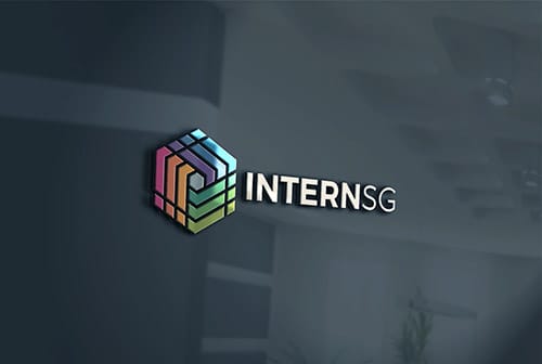
Congratulations to Nike Ficher for winning the contest. We have chosen the winner based on the logo’s concept in relation to our company’s identity. We understand that there are many ‘cube’ logos in the world (just like how there are always similarities in each company), but the aesthetic simplicity of this one, and the meaning behind it is what made us choose it. The ‘i’s in the cube represent the interns who are energetic (the stripes of energy) and vibrant (the colours) talents, that focus in helping a company achieve its objective (the center square).
We have tweaked the winning entry slightly for our final logo, so it looks cleaner, and can more clearly convey the identity of our company. We hope that the logo shall better position us as a company with a clear unchanged mission to generate value for the business community by supporting corporations achieve greater human capital efficiency, and helping students grow to become outstanding professionals in the future.
For everyone who have send us your entries, we thank you all once again for the time and effort. There are many excellent entries, and we have certainly enjoyed looking at your creative work!
